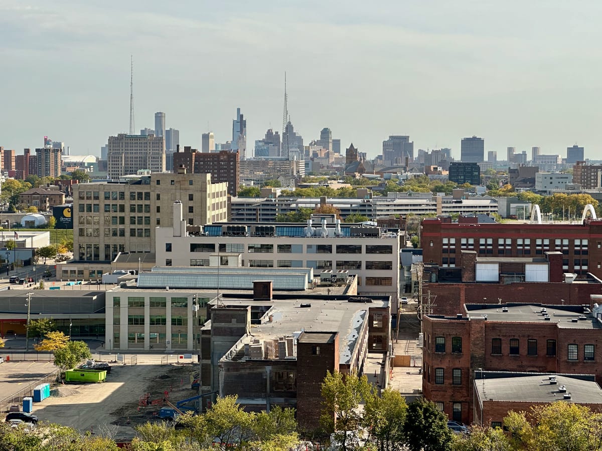
We at Daily Detroit love telling stories with visuals. It’s said a picture can tell the story of a thousand words, and we think the maps above as an animation and below, as something you can play with for yourself, from the Center for Urban Research CUNY Graduate Research Center, tells many stories.
You have probably seen the map of our racial divide in 2010 with all of the color dots, showing the outline of Detroit. But although a compelling visual, it’s static, and so only tells a limited story. But there’s more – and the data shows Metro Detroit’s racial demographics are shifting, and shifting quickly.
What we have here is probably a more accurate picture of what’s happening on the ground in our region than the oft-cited dot map referenced above. It adds another dimension – time – as well as graduation of color to show percentages on a per-block basis. One can only wonder what this map will look five years from now in 2020. There’s little reason to think the march of change has stopped.
What it shows is that Metro Detroit’s suburbs are getting more diverse, and we’re continuing our sprawling ways. We’re a region, as a whole, whose population has stayed basically stagnant for half a century while the city lost people.
Beyond the animated gif above, if you’re interested, we have some observations below the big map that you can play with yourself. You should zoom in to your neighborhood; that’s part of the value of block-by-block maps.
Before we jump in, there’s a legend on the embedded map but here’s a quick breakdown. The darker the color, the higher the percentage of that particular race. Blue = white, orangey/red = black, green = hispanic, purple/pink = asian, black/gray = other. Drag the slider to the left, you get 2000. To the right, 2010.
- Southwest Detroit is getting less white, and more hispanic.
- Zoom in if you can on Harper Woods. You can see the entire city turn from one color to another, almost right on city lines.
- By 2020 at this pace, it’s possible 8 Mile won’t be anywhere as prominent as it once was as a racial divide.
- Zoom down to the block by block level. If you click on the block, it’s fascinating to see the numbers move in double and single digits.
- African American migration seems strongest to the north and west of Detroit, out those corresponding freeway corridors (M10 and I-96).
- Notice how little is solid blue (more than 90% white) in 2010 compared to 2000.
What are your thoughts?


